Building

MiCA is two triangular towers where Milwaukee meets California. Residences feature a contemporary aesthetic, thoughtful floor plans, and beautiful amenity spaces.

A new public plaza along Milwaukee Avenue adjoins and connects the two towers, linking MiCA residents with the Logan Square community.

Steps away from MiCA brings you to public transportation, diverse cultural experiences and unique food and drink.
Features

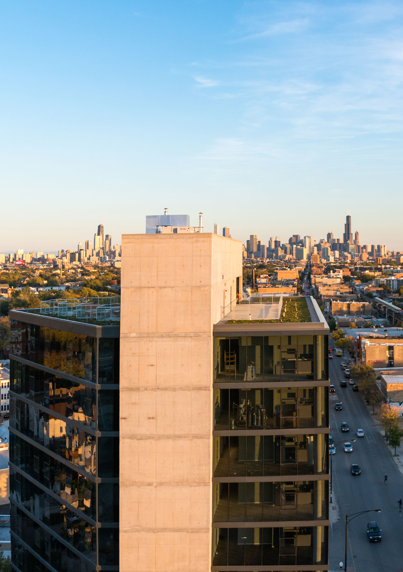
Spacious units featuring contemporary finishes and 10’ or 11’ ceilings. Large floor-to-ceiling windows allow for maximum light exposure in all units. Wide plank wood-style flooring create light and bright spaces. Kitchens feature stainless steel appliances, garbage disposals, gas stovetops, dishwashers, durable quartz countertops, and balconies in select units.

Find utmost comfort year-round with on demand heating and cooling. AT&T U-Verse Cable and Internet is an all-inclusive utility package. Base services include 1 Gbps Internet, one (1) HD-DVR cable box, and ~300 channels. Hardline and VoIP phone services are available.

  • In-Unit Gas Washer & Dryer
  • Expansive 10’ or 11’ High Ceilings
  • Floor-To-Ceiling Windows
  • AT&T U-Verse Cable & Gigabit Fiber Internet Service
  • Contemporary Interior Finishes
  • Interior Thermostats With Heating & Cooling On Demand Year-Round
  • In-Sink Garbage Disposal
  • Track Lighting
  • Custom Kitchens With Quartz Countertops
  • Stainless Steel Whirlpool Gas Stove, Oven, Dishwasher & Refrigerator
  • Microwave With Integral Exhaust Hood
  • Hardline Phone Services Available
  • Acoustically Conditioned Demising Walls
  • Pet Friendly: 2 Pets Per Residence Allowed
  • Wood Plank-Style Flooring
  • Generous Bedroom Closets
  • Balconies In Select Units
  • Resident Experience App
  • Online Residency Portal
Wheelr Kearns Architects

The Story Behind the Architecture

Dan Wheeler, FAIA, is a founding principal of Wheeler Kearns Architects. Here he tells the story behind the concept and design of MiCA.

Learn More

Step One:
What does this site offer?

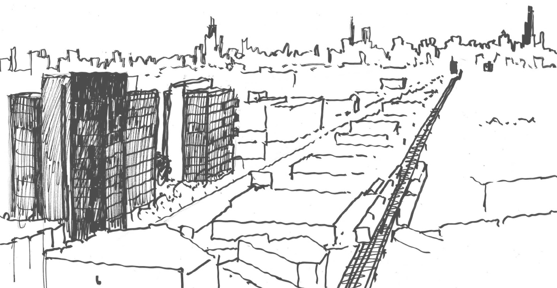
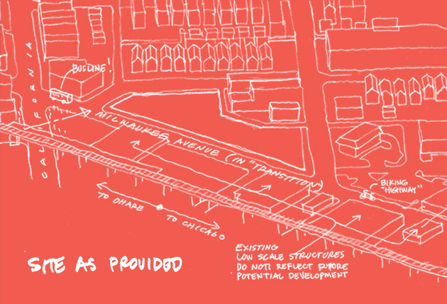
Milwaukee Avenue is in a rapid state of evolution. Currently a hardened urban thoroughfare, the at-grade experience of the street/site is long and exposed, narrow sidewalks, unrelenting.

Our challenging “flattened bowtie” site benefited from being steps away from the CTA’s California stop on the Blue line and having major presence on Milwaukee Avenue with two corners to “hold”. In step with the city’s planning goal to densify the ever-evolving city using Transit Oriented Design (TOD) principles, the project sought to responsibly reduce parking loads, provide relief and activate the street the street experience, diversify available housing types, while providing acoustic and visual shelter to the residential fabric directly to the north and east.

Step Two:
“Testing out the conventional solution”

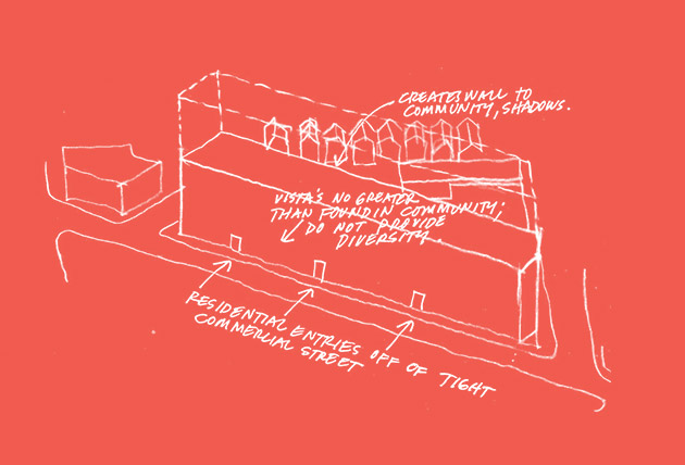
In assessing the site potential for best residential and commercial use, a low-rise building was first explored, running the length of the Milwaukee corridor. The resultant massing was found to wall off the residential district behind; studies showed that it put the adjacent residences into shadow for extended periods of time. The sidewalk seemed oppressively narrow and long, with no relief with signs alone being frontal to the passers by. The residential units developed above fronted onto the din of the busy avenue, with limited vistas onto parking and commercial activities. This would add to housing stock already available in the neighborhood; we wondered if there was a better alternate.

Step Three:
"What if"

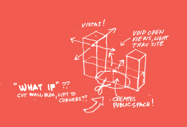
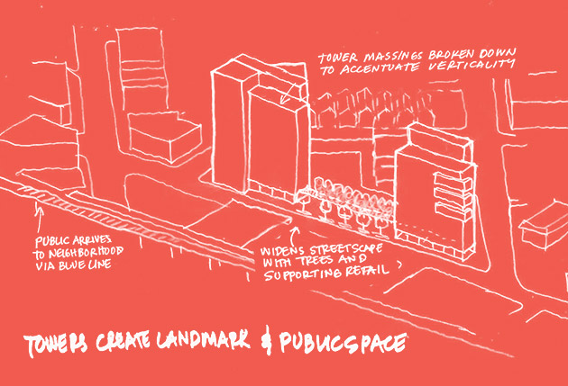
We asked: “what if we simply cut the long building in two?”, turn them on end and place in the corners, with a taller building close to the “L”, a shorter one to the city. This limited the building footprint and created an open space between the two buildings that the public can share. The landscaped space countered the hard surfaces, widened the pedestrian experience, allowed light and air to better flow into the neighboring properties; and provided diversity in residential units found in the community. It visually anchored the key intersection of the neighborhood, much as the Northwest Tower (a/k/a Coyote Building at North and Damen creates the marker for Bucktown / Wicker Park.

Step Four:
Developing the idea.

The project anchors a transportation hub; presents two contemporary buildings that offer a housing type to date unavailable in this community, framing a new public garden, a social place for the community/events. The complementary buildings are seen as two unique characters, purposely varied in height and massing to express verticality and to front varied exposures. Each building places its residential entry off the corner from Milwaukee, in favor of activating the Avenue with supporting commercial activities and the public plaza. The plaza is about natural textures, with an acoustically absorbing gabion wall covered in ivy and a stand of trees linking the buildings with a green edge. Perimeter wood seat ledges face the court and street-life, punctuated by monolithic boulders placed compositionally to give a natural focal point to the space.

Ready to meet MiCA?

Schedule a Tour